
One of my favorite 20th century cartographers is Richard Edes Harrison. Here's why...
RE Harrison created many maps for magazines including Fortune magazine. In fact, Fortune even released an atlas of Harrison's maps during World War II to show the danger of Axis power to the US. I drool over many of Harrison's because he melts artistry into illustrative maps that most everybody else would trash into bland info-graphics.
I was lucky to find a few of his maps at The Visual Telling of Stories by Dr. Chris Mullen. A great resource, by the way! Be sure to visit.
Here is what I think is the most perfect map ever produced...
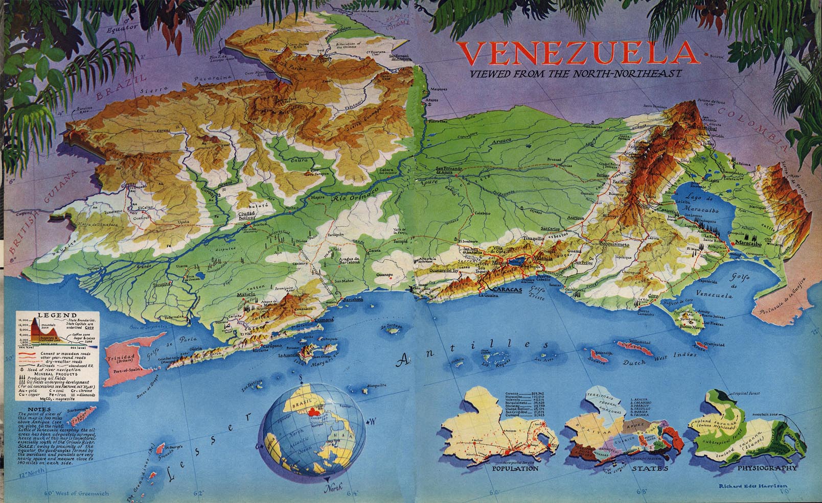
Click image for full size.
In his Map of Venezuela above the main map merges the precision of modern cartography with artistry and thematic mapping. The physiographic representation of mountains with elevation, as well as symbolism by including mineral products (oil, gold, etc.) are perfectly executed.
To add vital information to the main map there are three thematic maps that show population, states, and physiography. So you can see that the main map shows the overview spatial relationships of the map theme, and the sub-maps provide useful additional information that would otherwise clutter the main map's theme.
And look at the subtle detail... sub-maps are shadowed to visually raise them above the map, to say "this is additional information, not part of the map". And the inset globe shows where in the world this location is. Notice that north is down and mirrors the perspective of the view of the main map. I think this is a fantastic educational addition to inform younger map readers and others who don't have previous knowledge of the geography of South America. It doesn't take much room, but is extremely valuable to a certain segment of viewers.
And look at the vegetation. The vegetative border does two things...
- Artistic It gives a sense of the geography of the location by adding a tropical flavor to the map. This removes it from a purely abstract representation to make it more real. The map reader can imagine the felling of walking in Venezuela and what plants they may come into contact with.
- Practical It anchors the map by providing a visual barrier to prevent the reader from wondering up the map into Brazil or Columbia and the rest of South America. Instead, the reader is kept centered on Venezuela.
Notice, also, the use of color. Brazil, Columbia, and British Guiana are all cool colors that recede into the background, while the ocean in front is a warm blue to draw the reader in visually. And it is the same for the island land masses that are warmer pinkish red to bring them forward to the viewer. Furthermore, Columbia on the right side of the map becomes warmer as it approaches the ocean. So Harrison has essentially applied a gradient fill to the underlying land masses representing the background of his map.
The color gradient is warm near the reader and cool away from the reader to actually give you a feeling of the earth's curvature.
Finally, Harrison is sure that you don't miss the theme of the map, Venezuela. He puts the title in bold, bright red contrasting against every other object in the map.
Color contrast in the title to establish the theme of the map is a technique Mike Reagan also uses.
Take the excellent map and provide elements that give a sense of the locational geography, in this case the vegetative border, and you have an informative, beautiful map created by a master of map information.
Click here to read more decorative map articles.